The Ark · Charity
A thirty-year lifeline that almost nobody outside had heard of
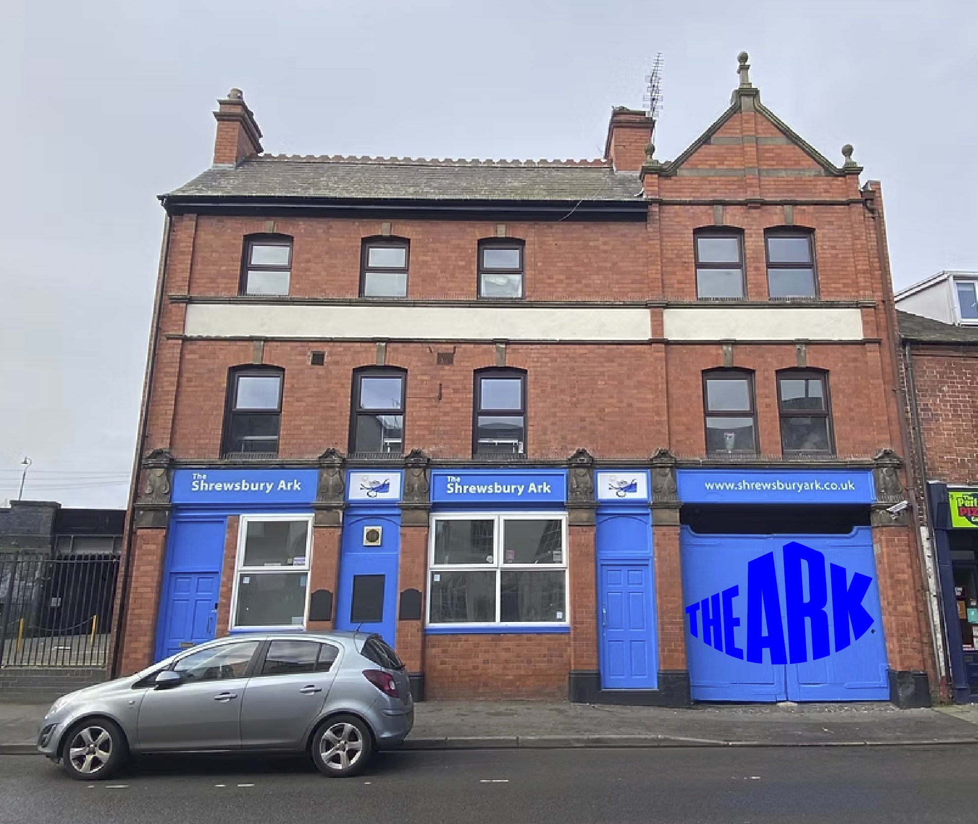
The Ark has fed, warmed and stood by people facing homelessness in Shrewsbury for over thirty years. Everyone who had been through the door knew exactly what it was. Almost nobody else did.
The problem
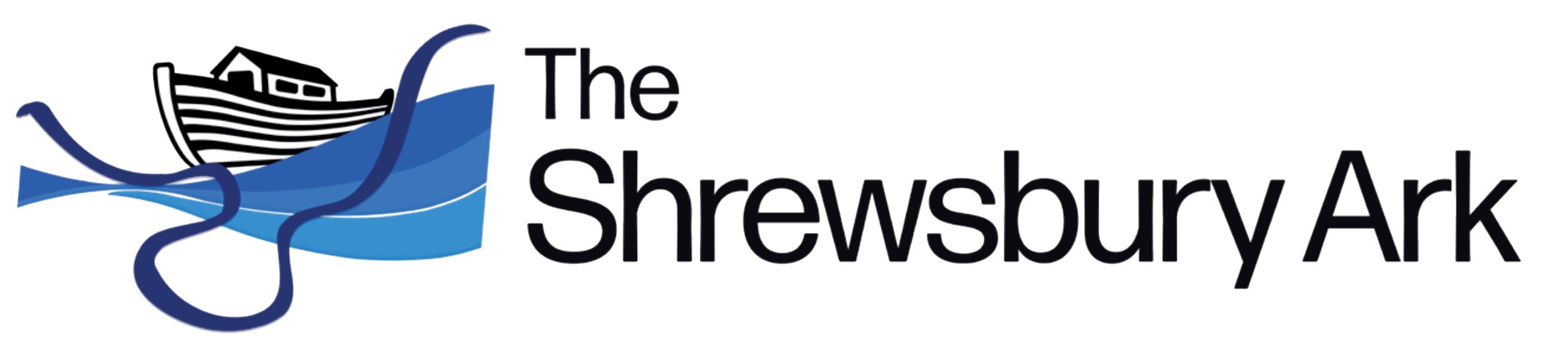
The old identity was a small drawn boat, a wave and a line of type: three things competing for one moment of attention. It read beautifully at the top of a letter and vanished everywhere else, on a van, a collection tin, a banner across a street. For an organisation whose survival depends on being noticed, being invisible in public was the whole problem.
See
In the room with trustees, staff and people who use The Ark, we asked what it is and what it must never be mistaken for. Three drawn elements were competing for one moment of attention, and losing everywhere but the letterhead.
- Stakeholder workshops
- Identity audit
Shift
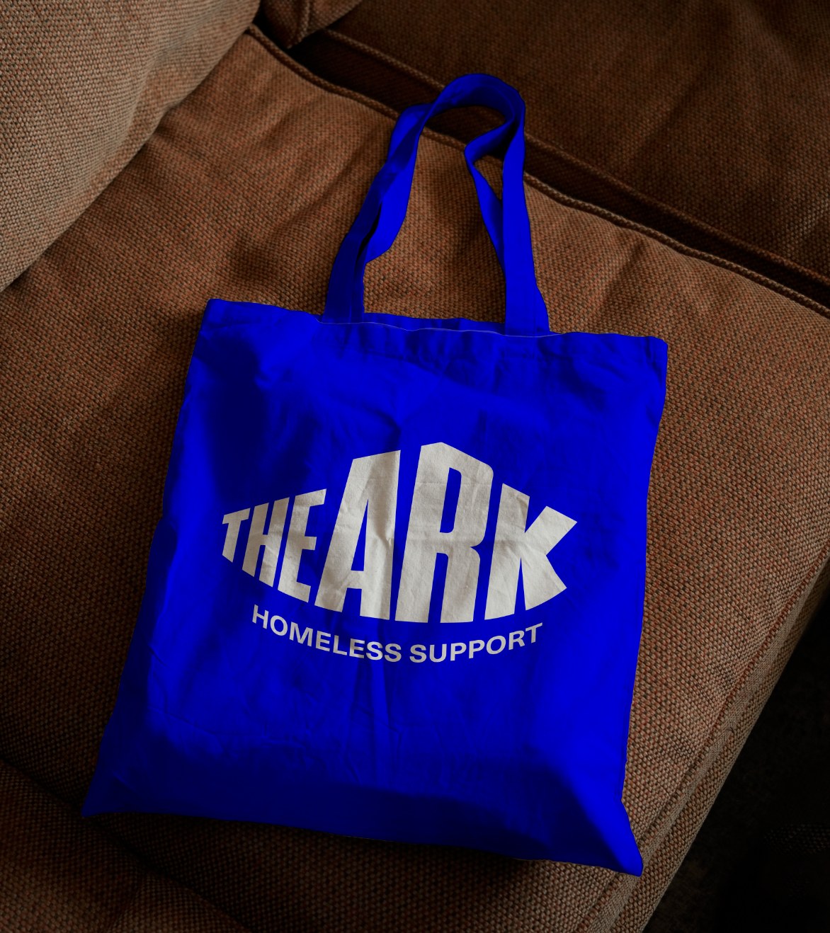
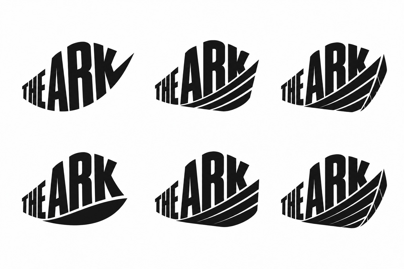
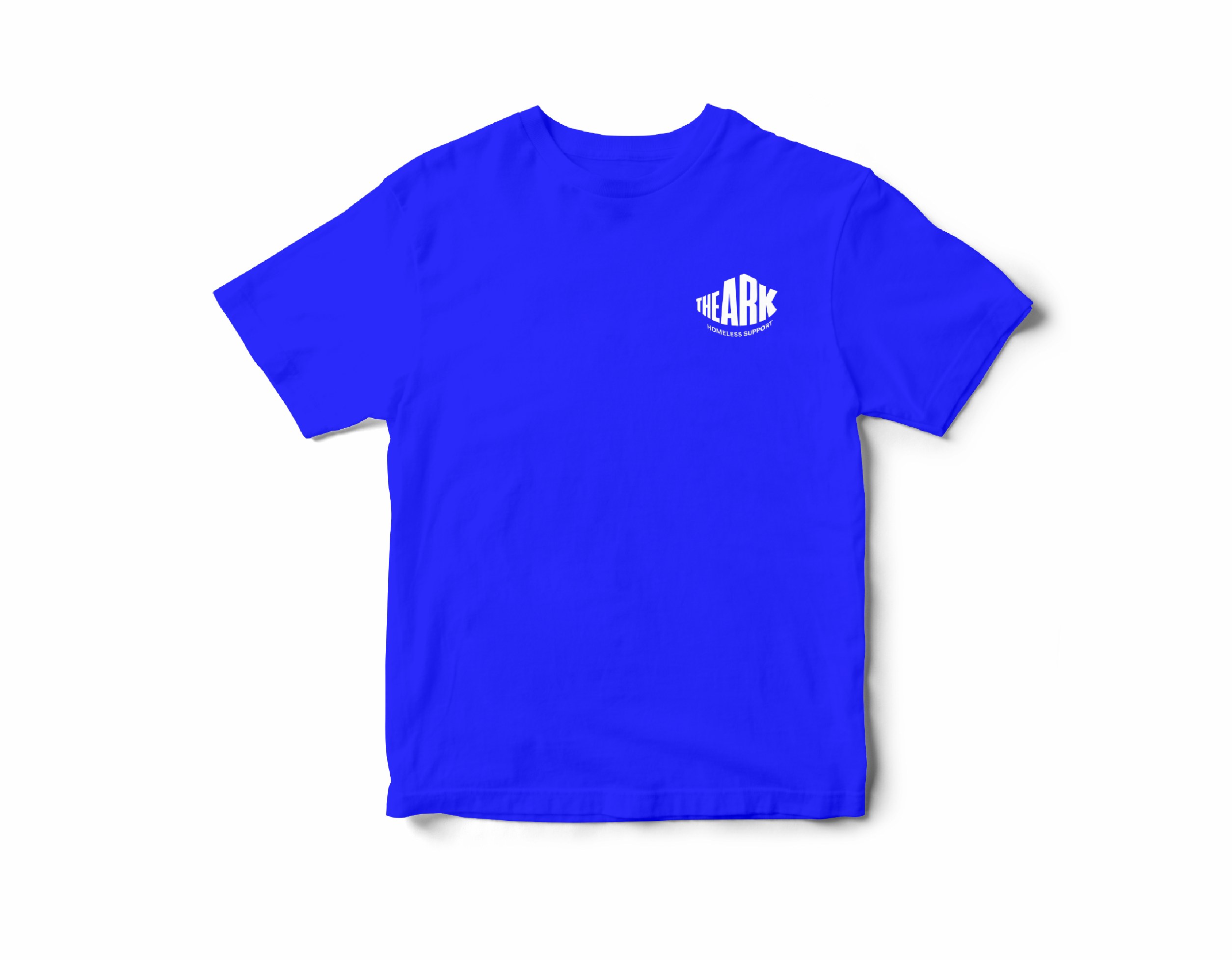
A logo does not have to be a literal picture of what you do. We reduced three competing elements to one: condensed capitals nested inside a single hull, with Homeless Support arcing beneath like a keel. The A and the R meet like a corner, so the mark reads as an architectural, physical place rather than an illustration of one. One shape, one shelter, one colour.
- Brand strategy
- Proposition
Build
It started in a room, not on a screen.
We spent an afternoon with trustees, staff and people who use The Ark, asking what it is and what it is not. What came back was unusually clear. A place that never gives up on you. A place you can screw up and it will still be there. And, said with more force than anything else, a list of what it must never be mistaken for. Every decision that followed traces back to that afternoon, and we showed the room those words before we showed them a single drawing.
One colour, used without apology.
Ark Blue is pure, saturated and deliberately loud, because a single ownable colour becomes recognisable faster than any logo does. The identity pairs a fine editorial serif for the one statement that has to land with a clean, highly legible sans for everything a person actually has to read. Both openly licensed, so a charity is never tied to a renewal it has to remember.
Handed over so it survives us.
Identity work fails when the files sit in a designer's folder. We delivered an online brand guide the team can use on a phone, with every logo format, plain-English rules for which version to use when, click-to-copy colour values, the honest limits of a pure blue in print and fabric, and a developer section the website team can build straight from. Accessibility is specified, not assumed, because of who The Ark serves.
- Visual identity
- Signage
- Brand guide
Move
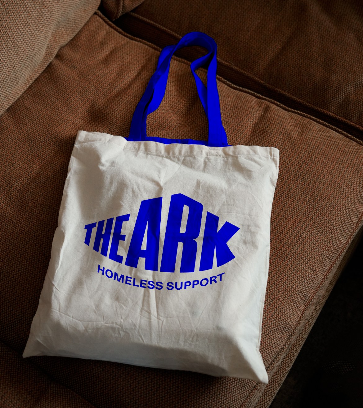
Signed off in the room by trustees, staff and people who use The Ark, with the brand guide and full asset library delivered days later. The Ark now has a mark that works on a van, a wall, a shirt and a funding application, and refuses to be mistaken for anything it is not.
- Full asset library
- Handover
- Sign-off in the room
What’s the thing you’re trying to change at the moment that you’re finding hardest to make happen?
Work with usNext project